People scan first and decide later
When someone lands on a website, their brain asks a few questions almost instantly.
Is this relevant to me?
Do I understand what this is?
Can I trust this?
To answer those questions, the brain scans the page for structure, keywords, and cues. Research into attention and cognitive load shows that when information feels hard to process, people disengage quickly instead of slowing down. This pattern is well documented in behavioral studies summarized by Microsoft Research.
This is why adding more explanation rarely helps. If the page does not feel understandable fast, visitors do not read further to “figure it out.”
They leave.
The F-pattern explains why most copy is ignored
Eye-tracking studies have shown that people often scan web pages in a predictable pattern known as the F-pattern. This behavior has been documented repeatedly by Nielsen Norman Group.
Visitors scan across the top of the page first.
Then they move slightly down and scan again.
After that, they scan vertically along the left side.
This has practical consequences.
The top of your page carries the most weight.
The first words of each line matter more than the rest.
Anything buried in long paragraphs is likely never seen.
When founders say, “We explain that further down,” the reality is simple. Most people never reach it.
Headings do more work than paragraphs
Because people scan, headings are often more important than body text.
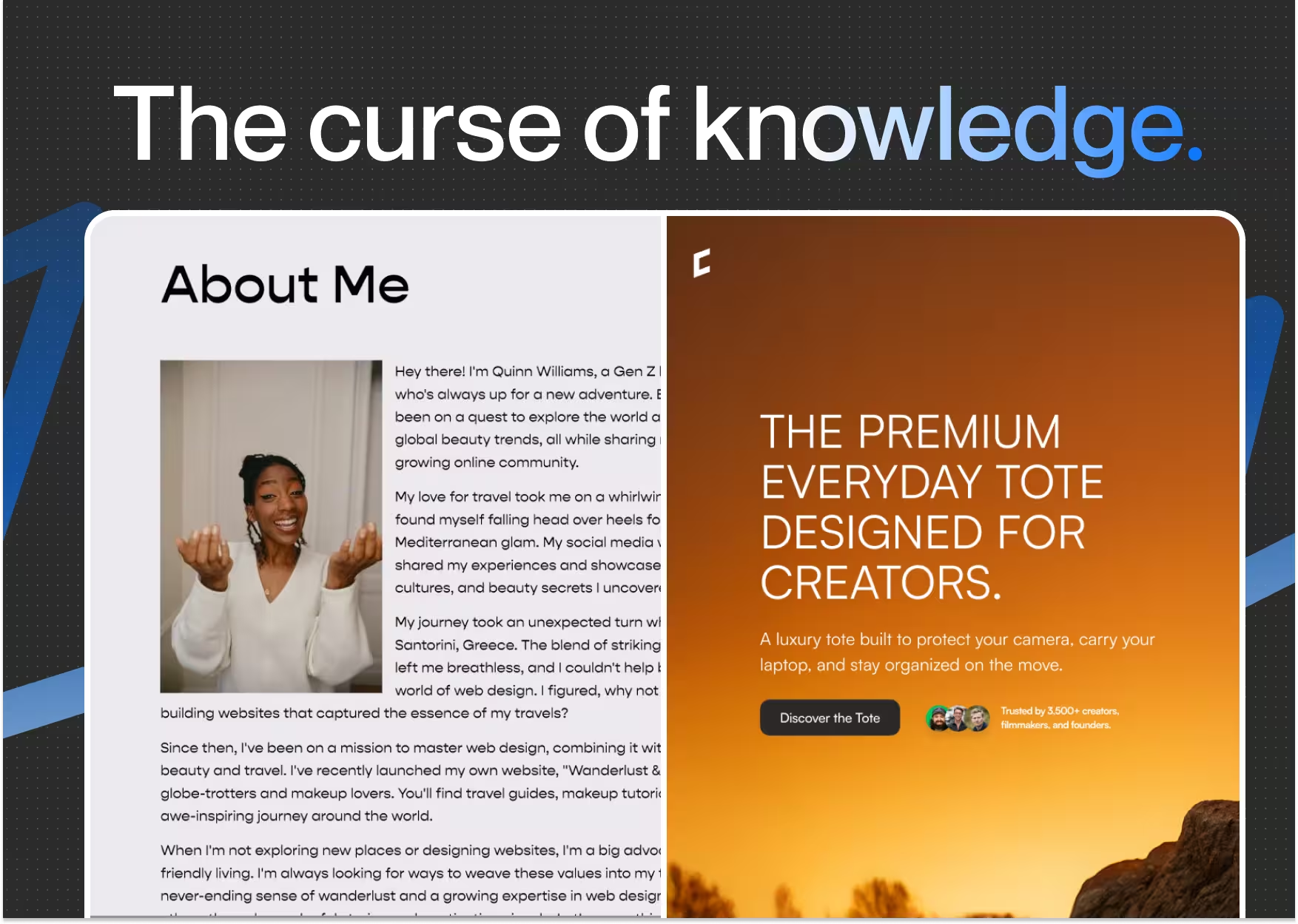
Many visitors will only read your headlines and subheadlines. They use them to decide whether the page is relevant. If the headings are vague, clever, or generic, the page feels unclear immediately.
Usability research consistently shows that users rely on headings to understand structure and meaning. Publications like UX Movement have highlighted how descriptive headings dramatically improve comprehension and engagement.
Clear headings allow people to understand your page without reading everything.
Weak headings force people to work.
And most people will not.
Why walls of text fail online
Large blocks of text are one of the fastest ways to lose attention.
Even when the content is good, the brain perceives effort. Long paragraphs increase cognitive load and create friction. Research into reading behavior shows that users skip dense text instead of partially reading it.
Short paragraphs, clear spacing, and simple sentences make reading feel manageable. This does not reduce depth. It increases comprehension.
This is not about writing less. It is about making information easier to process.
Visual hierarchy guides attention
How content looks affects how it is read.
The brain is constantly deciding where to look next. Font size, spacing, contrast, and layout all signal importance. When everything looks the same, nothing stands out.
Research on visual attention and perception, including work shared by Google Research, shows that users form impressions and expectations extremely quickly based on visual structure alone.
Good hierarchy guides the eye.
Poor hierarchy forces decisions.
When visitors have to decide what matters, they often decide to leave.

.avif)