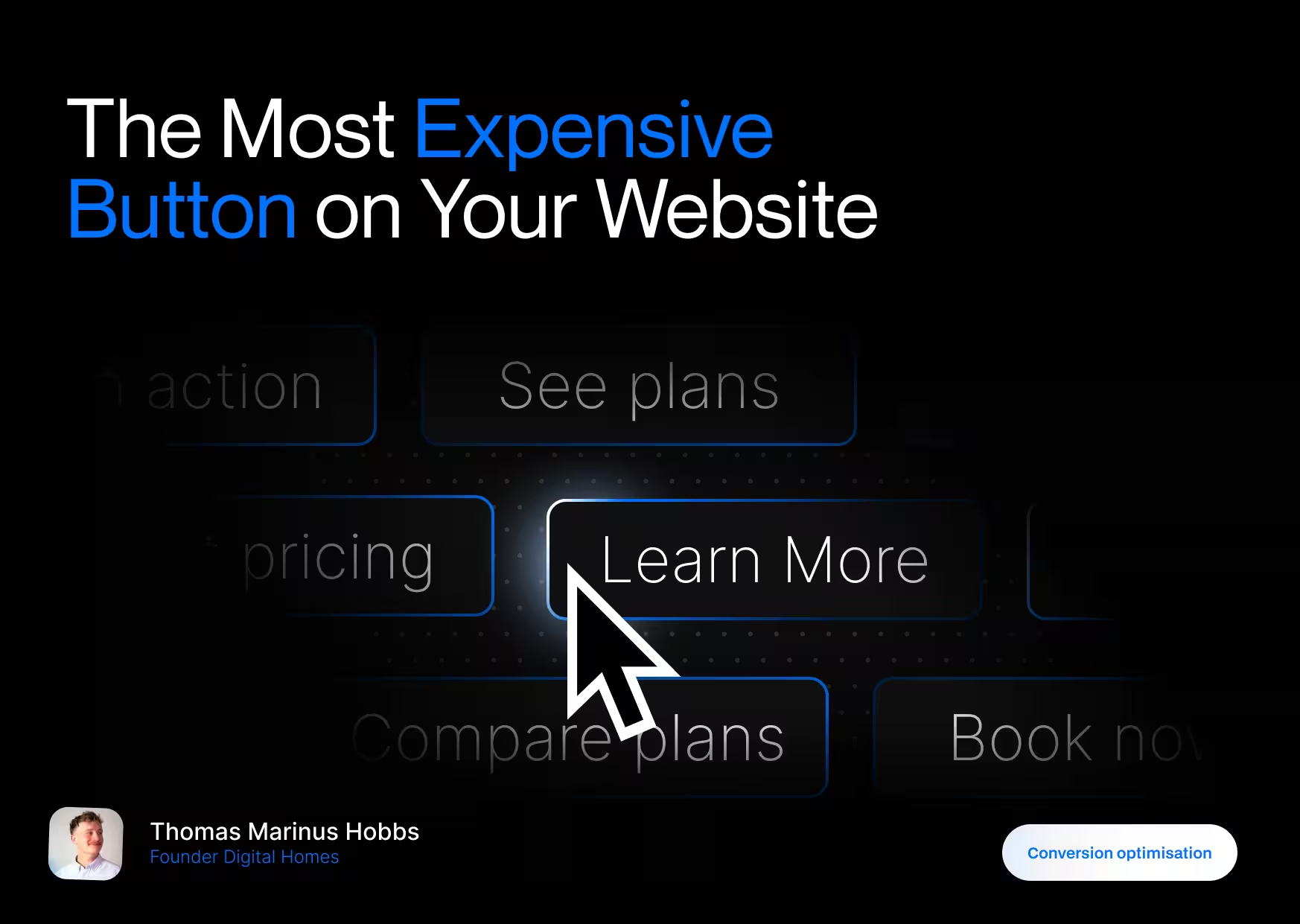
“Learn More” Sounds Safe. That’s the Problem
“Learn more” feels like a neutral choice.
And neutral choices don’t convert.
When someone lands on your website, they’re subconsciously asking three questions within seconds:
- What is this?
- Is this for me?
- What should I do next?
A CTA is supposed to answer question 3, but “Learn more” doesn’t.
- It doesn’t say what they’ll learn.
- It doesn’t say why it’s worth clicking.
- It doesn’t say where they’ll end up.
So the brain does what it always does when something is unclear:
It pauses. Or it leaves.
This isn’t a design problem. It’s a decision-making problem.
Vague CTAs Create Friction (Psychology, Not Opinion)
From a psychology standpoint, “Learn more” triggers three things you don’t want:
1. Cognitive load
The visitor has to think.
- “Learn more about what?”
- “Is this a sales page?”
- “Am I committing to something?”
Every extra question lowers the chance of a click.
Nielsen Norman Group consistently shows that unclear links and CTAs reduce interaction because users can’t predict the outcome of their action. When the outcome is uncertain, people default to inaction.
Source: Nielsen Norman Group – link clarity & information scent research
2. Effort without reward
“Learn” implies work.
It sounds like reading.
Processing.
Time investment.
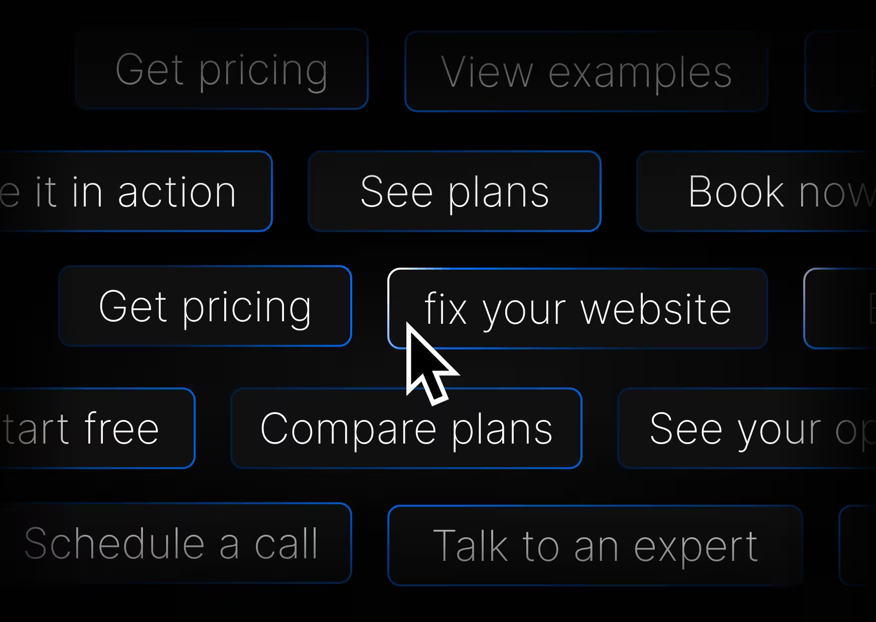
Compare that to:
- Get pricing
- See it in action
- Start free
- Book a call
Those promise movement, not effort. CTA copy that implies a clear outcome consistently outperforms vague wording.
Multiple CRO studies show that specific, action-driven CTAs outperform generic ones by over 100%.
Source: HubSpot CTA optimization data
3. No urgency, no direction
“Learn more” doesn’t push forward.
It doesn’t say now.
It doesn’t say next.
It doesn’t guide momentum.
Founders often wonder why users scroll, read, then leave.
This is why. The site never told them what to do.
The CTA Is Not a Button, it’s a Decision
A call to action is not UI.
It’s behavior design.
Your CTA is the moment where someone decides:
- to engage
- to trust
- or to bounce
Great CTAs reduce risk and increase clarity.
Bad CTAs outsource the decision to the user.
And users hate deciding.
Why Specific CTAs Convert Better
Specific CTAs work because they remove uncertainty.
They answer the question:
“What happens if I click this?”
Compare these side by side:
- Learn more
- Get pricing
- Learn more
- Watch the demo
- Learn more
- Start free
One set feels passive. The other feels obvious.
That’s not marketing magic. That’s how the brain works.
Clear actions = less thinking = more clicks.
Source: CXL Institute – CTA clarity & conversion psychology
Real Examples (Good vs Bad)
Here’s what this looks like in the real world.
Bad example
A SaaS homepage with:
- “Learn more” under every feature
Result:
Users don’t know which link leads where.
They scan, hesitate, and leave.
Good example:
Platforms like Squarespace and Stripe use:
- Explore commerce
- Start building
- View templates
- See pricing
Each CTA matches the intent of that section.
The user doesn’t have to guess.
.avif)